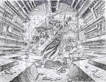
This is Pat Broderick's original breakdown for pages 2 and 3 from Issue #2. Notice the double page spread has a central focus in order to draw the eye to the center of the action.
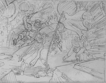
Here, Daniel Mann takes Pat's original breakdown and tweaks it for certain effects while keeping the integrity of the character layouts. First, he opens the space up so it shows the grand scale of the arena. Next, he moves the main characters off center so they become part of the games and not the central focus. Finally, he makes the flag more prominent and flapping in the wind to create a depth of space element.
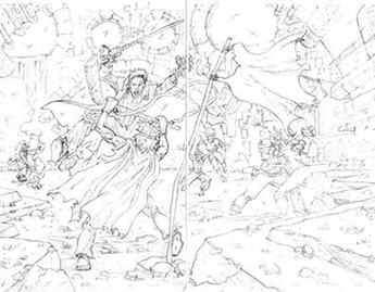
After the breakdown is finalized Daniel Mann finalizes the pencils. He adds details such as rocks, shadowing and light source. X's are commonly used for the inker to see where large areas of black would be placed.
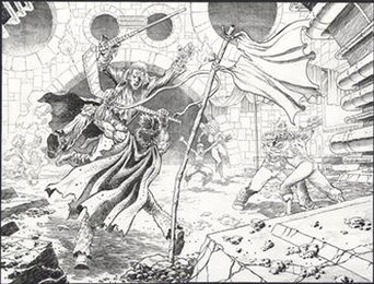
Here is Pat Broderick's final ink for pages 2 and 3 of Issue #2. Notice how he uses thinner black line the farther back in space it goes. This effect, known as atmospheric perspective, is similar to lightening background trees in a painting to create distance.
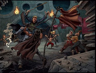
Jamie Hood puts the final touches on in the coloring stage. Although there may be one or two adjustments, this scene shows his level of expertise at making wise color decisions. The color is often what defines the look and feel overall of the book.
