Step 1.
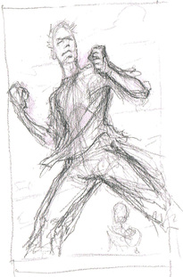
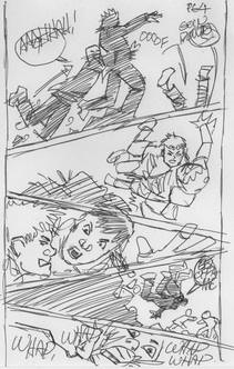
Shown here is Pat Broderick's breakdown, which he created for Page 4 of Issue 1 of "Forgotten City." His quick sketch demonstrates a great example of how sequential art can be thought about. Notice the staggered, uneven panel boxes that convey energy, as well as a sense of action and intensity.
Shown here is Pat Broderick's breakdown, which he created for Page 4 of Issue 1 of "Forgotten City." His quick sketch demonstrates a great example of how sequential art can be thought about. Notice the staggered, uneven panel boxes that convey energy, as well as a sense of action and intensity.
Step 2.
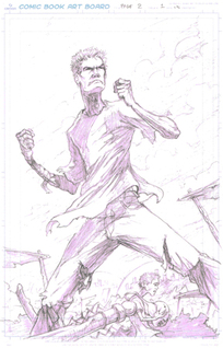
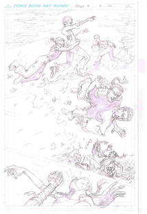
For the penciling stage, Daniel Mann utilizes Pat Broderick’s original breakdown scene and refines it for story and pacing. Notice that a secondary boy (the main character's younger brother, Dirt) was added standing atop of the junk pile in Panel 1. Dirt was incorporated into the scene to illustrate his concern for his brother, who is under attack. The change in the bottom half of the page was made to add simplicity and to smooth the transition to the next page.
For the penciling stage, Daniel Mann utilizes Pat Broderick’s original breakdown scene and refines it for story and pacing. Notice that a secondary boy (the main character's younger brother, Dirt) was added standing atop of the junk pile in Panel 1. Dirt was incorporated into the scene to illustrate his concern for his brother, who is under attack. The change in the bottom half of the page was made to add simplicity and to smooth the transition to the next page.
Step 3.
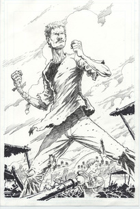
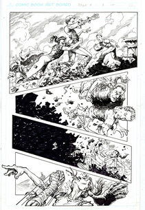
Following the penciling stage, the artwork is defined in black ink. Artist Pat Broderick completed the inking stage for Issue 1, Page 4 as shown to the left. Broderick's gritty line work lends to the feel and mood the team sought in the final art.
Following the penciling stage, the artwork is defined in black ink. Artist Pat Broderick completed the inking stage for Issue 1, Page 4 as shown to the left. Broderick's gritty line work lends to the feel and mood the team sought in the final art.
Step 4.
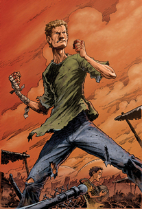
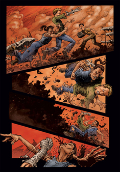
The final step in creating the artwork for Page 4 of Issue 1 is the color stage, shown here as completed by Jamie Hood. The selection of the color orange for the sky sets the apocalyptic mood and despair. A blue sky would have conveyed calm and serenity, rather than the tension and emotion that this scene calls for. What else does this artwork suggest to you?
After this stage, the artwork is ready for lettering which conveys narration, dialogue, and sound effects.
Click here, Issue 1, Page 4, to view the finished page in context.
