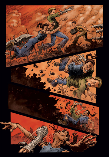
| We thought it would be fun to take readers through the development of “Rat,” one of the most intriguing characters in the “Forgotten City” series. Rat makes his first appearance at the end of Issue 3. Shown at right, is the character as originally conceived—a former scientist, who had been kept in a cell for years. | 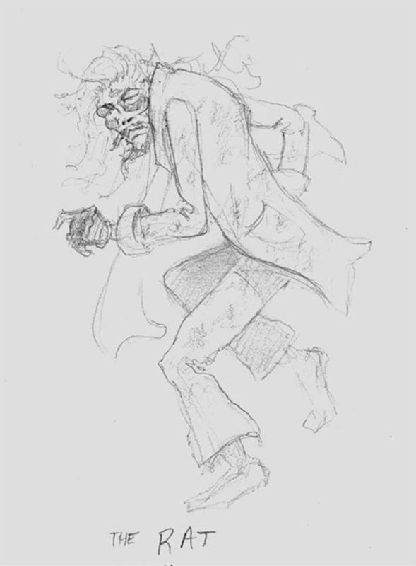 Click to enlarge. |
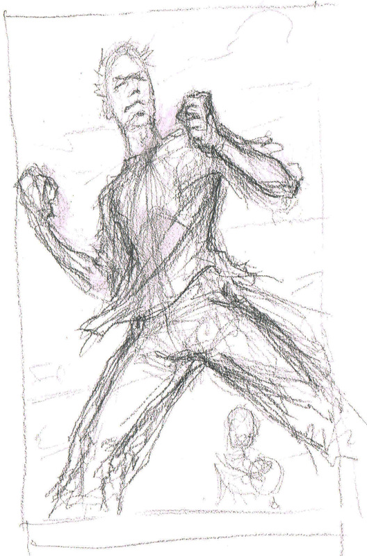
 Click to enlarge. | Here, at left, artist Pat Broderick’s interpretation of Rat is a great literal approach to the name and had just a cool overall feel to it. Although the team loved it, they felt that the character needed to have a more human side. |
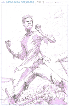
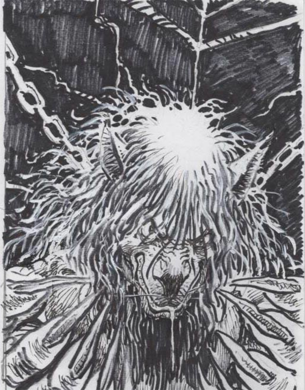
| In the sketch to the right, Daniel Mann changes the foreground hand closer to the original pencil to give the Rat a creepier, more robust feel. He achieves this by elongating the fingers and showing the bone structure under the skin. The uncut fingernails also are emphasized to show Rat’s isolation from society. | 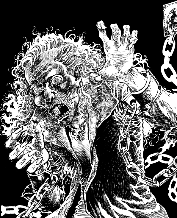 Click to enlarge. |
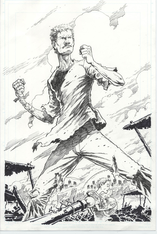
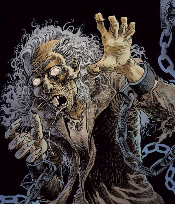 Click to enlarge. | In the completed vision of the character on the left, Jamie Hood has colored Rat masterfully. The eyes are muted, giving the character a more mysterious look, as well as suggesting the dark isolation he endured throughout the story. |